With OS X Yosemite’s arrival fast approaching, we decided to sit down with some of our designers here at MacPaw and ask them their thoughts on the new OS. We came up with 5 questions that we thought would stir up some conversation. Enjoy!
What was your first impression of OS X Yosemite?
Dmitriy @Novikoff (Product Designer): “My first impression of OS X Yosemite was that the system had become cleaner and, on the whole, it seemed to work faster. The new interface font turned out to be a bit unusual to me — Helvetica Neue instead of Lucida Grande, but now it suits the interfaces better.”
Paul @Grozyan (Product Designer): “Well, first of all, I have to start with the fact that this year I visited the WWDC for the first time. It was a great experience for me, a time full of impressions and expectations. And all of my expectations were met when Apple’s Craig Federighi took the stage to tell us about the future OS X 10.10. The visual design was brand new. In a moment, the era of three-dimensional interfaces was drowned by the simplicity and lightness of OS X Yosemite — I installed it right after the presentation.”
Sergey @Grigoruk (Marketing Designer): “I’ve been a beta tester since its release, and it was really interesting for me to take a look what was new in Yosemite. My first impression? Yosemite had a clean look. Apple hinted at making OS X Yosemite look like iOS 7, but it really doesn’t resemble it all that much — And, I like that.”
What do you like and/or dislike about OS X Yosemite’s design?
@novikoff: Pros:
- There’s a clear unification in the icons’ design that simplifies the work for designers. The general look of the interface benefits from it.
- A new range of colors makes the interface brighter.
- I love the transparency with blur on app windows, it gives the feeling of lightness.
- The Yosemite Dark Mode feature, which makes the Menu Bar and Dock dark, is perfect for working in Final Cut, Logic Pro X, Adobe Photoshop, and Illustrator apps.
- De-cluttering, getting rid of unnecessary icons and icons’ details where they weren’t needed.
Cons:
- All icons are drawn with the new lighting rule in mind: cold source of light from the top and warm source with shadows from the bottom. It was a strange decision because it gives the feeling that the icon is dirty and cold.
- Some interface elements are misleading and require some getting used to. For example, the Spotlight query field and the search button look the same, but they work differently.
- Some icons are drawn carelessly, apparently in a big hurry (e.g. Game center, Calculator).
- The green maximise window button now makes the window full screen and it’s rather hard to get used to.
@grozyan: “Almost everything was modified — it’s significantly more convenient, more functional and at the same time, easier to use. Visually, the system has become lighter. But a crux is that some redundantly vibrant colors strain, especially the color of the folders in Finder.”
@grigoruk: Pros:
- Favorite visual update — the Dock icons look brighter now.
- I really like the cartoonish look of the Finder icon in Yosemite :-)
- The Notifications Center is fantastic, I like glancing over and seeing the stuff that’s important to me.
Cons:
- The System Preferences icon is lacking in… skeuomorphism? Yeah, it stands out. It doesn’t feel very “Yosemite.”
- The same with Security & Privacy.
- …Oh, and the hard drive icon, too.
“But honestly, I’ve gotten used to most of the things in OS X Yosemite — so maybe for the next OS X release, you could ask me right away?”
How has OS X Yosemite changed the way you work?
@novikoff: “If we’re talking about drawing icons, the designer’s work has become a bit easier. Now, there are clear drawing guidelines. There is a special grid that helps to align everything and understand which kind of lighting you should use. But, it’s a little bit more difficult to work out the behavior of transparency under different conditions and the logic associated with it.
“I like that about OS X Yosemite, we don’t have to spend much time on decorating the interface — we can pay more attention to functionality and clarity.”
@grozyan: “Yosemite has added a lot of work to all designers. The moment that designers got to take a look at OS X Yosemite, every app in the Mac App Store began to appear outdated. The look of windows, buttons, icons — everything; it all needed an update in order to prepare for the OS X 10.10 release. So, I’m sure that Mac software interface designers didn’t rest this summer :-)
“Moreover, now we can do our job more easily and more quickly. But at the same time, we need to learn more about interactive and experience design. The good thing is that we were prepared for this in advance.”
@grigoruk: “With the new Apple design guidelines stating the shape, grid, and lighting, it’s important to remember that these are exactly that: guidelines. You always begin working with the given tools and systems but, within those parameters, are trying to express your own vision. And it is vitally important to change, not only the design of the app, but also rethink the app itself.
“OS X Yosemite is moving toward ease of use, which is nice. As designers, we’re now using brighter colors and gradients, thinner pictograms, etc. Design is becoming cleaner and simpler. The funny thing is that Dribbblers have been all over this for a while now — it’s nice to see Apple catching up.”
How is MacPaw using the new design trends from OS X Yosemite?
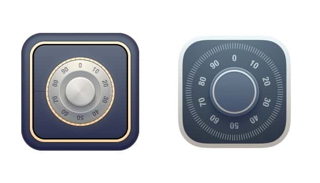
@novikoff: “Here at MacPaw, we’re always trying to follow the latest design trends. Lately, we’ve redesigned our Hider 2 app icon to make it look more native to OS X Yosemite. Below is our simplified Hider 2 icon:”

OS X Mavericks design (left) vs. OS X Yosemite design (right)
@grozyan: “In July, we had already come up with some good interface concepts for our apps that met the vision and inquiry of 10.10. The changes even permeated to our web application DevMate, a development and distribution assistance platform for Mac developers. In September, we updated its interface by greatly simplifying the visual style and improving the interaction. Now, it looks more native for developers. You can see the changes in the DevMate design below:”

Pre-September design (left) vs. Post-September design (right).
Data in the design is for display purposes only, not actual data.
@grigoruk:
“Who knows… Seriously though, our priority as of late has been updating our website to mirror the changes OS X Yosemite has thrust upon us. The funny thing is that we’re heavily web-focused, and what’s getting lost is that new style within our products. Take from that what you will, I just wonder how other companies are faring with these changes, and if they’re more web-focused or product focused.”
OS X Yosemite: a step forward or backward?
@novikoff:
“Today, flat design is in trend, but we understand that we can’t blindly follow such fashion trends in design. It allows you to make the design of your website or app cleaner and focus on the content, but everything should reasonable: a button should look like a button, and photo-realistic details and illustrations give more life to the look of the icon. I think this new design style is an experiment to reignite conservative designers’ thinking.”
@grozyan:
“I must stress that I like the philosophy behind the new interface. This makes life easier for both users and developers. The interface has become more intuitive. There are new ways of interacting and the functions improve the user experience. It’s opened up new opportunities for new and existing products.”
@grigoruk:
“iOS and OS X are getting closer and closer, and in the coming years, it’s not too far-fetched to think that they’ll be one in the same. The usability will always be different, Mac has a keyboard and mouse whereas iOS uses gestures and… Wait, am I going off-topic?”
And now we wait…
Hopefully, this was a nice little peek into the minds of our designers here at MacPaw. We’re all looking forward to the public release of OS X Yosemite, hopefully it’ll be tonight! Be sure to drop us a line on Twitter and tell us your thoughts on OS X Yosemite.


