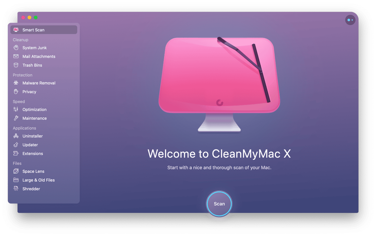
We’re pleased to announce that CleanMyMac has received the Red Dot Award: Brands & Communication Design 2021. The international jury recognized CleanMyMac among thousands of other products from over 70 countries in the Interface & User Experience Design category.
“Our jury was amazed by the quality of the submissions to the Red Dot Award: Brands & Communication Design 2021. The fact that you managed to stand out in such a strong and international field of competitors and impress the experts is proof of your design skill. Your award-winning project is outstanding”, says Prof. Dr. Peter Zec, founder and CEO of Red Dot.
Red Dot is an internationally recognized seal of excellent design, so we’re proud to be honored with such a prestigious award.
About the Red Dot Award
With roughly 20,000 submissions, the Red Dot Award is one of the biggest design competitions in the world. It is divided into three disciplines:
- Red Dot Award: Product Design
- Red Dot Award: Brands & Communication Design
- Red Dot Award: Design Concept
Red Dot looks back at a tradition spanning more than 60 years. In 1955, a jury came together for the first time to evaluate the best designs of that era. In the 1990s, Red Dot’s CEO Prof. Dr. Peter Zec developed the name and brand of the award. Ever since, the distinction “Red Dot” is a sign of outstanding design that is highly regarded internationally.
The laureates are celebrated at the Red Dot Gala award ceremony. Moreover, all winners are presented in Red Dot’s yearbooks and museums, as well as on the Red Dot website.
The secret behind CleanMyMac’s design
Design is one of the core values at MacPaw. We pay attention to details in everything we do and strive to build products that are simple and pleasant to use. "At MacPaw, design is a team sport — together, we create easy-to-use, aesthetically pleasing products that we continuously improve", says Oleksandr Pronsky, Design Lead at MacPaw. We believe that humanizing digital experience and making interfaces feel more alive and fun will make useful things unboring.
CleanMyMac’s new design (the one honored with the award) was created with our users’ needs in mind. We aimed to make the application more intuitive and help users focus on important things at any given time. That’s why we’ve implemented a number of useful innovations:
- A literally outstanding sidebar menu to provide easier navigation through the app.
- Subtle 3D parallax animations for a more in-depth experience.
- Powerful micro animations to draw user attention to what’s important at a particular moment.
- Interactive hover effects and atmospheric sounds to make the process of optimizing a Mac more exciting.

All design solutions in CleanMyMac are about simplicity, clarity, and functionality. For a good reason, CleanMyMac has a minimum amount of screens, buttons, and other elements to guide the user through the app.
We believe that treating CleanMyMac not as a utility but as a work of art is what makes our application unique. We care a lot about details and spend much time tweaking colours and different elements. As a result, our users can enjoy an intuitive and beautiful application that turns the tedious task of maintaining computers into a pleasant and almost magical experience.
Congratulations to the CleanMyMac Team and everyone involved in the creation of the new design. And a special thanks to you, our users, for taking this awesome journey together ❤️
Thanks for reading and stay tuned — the best is yet to come!


