When I first started testing macOS Tahoe vs Sequoia on my MacBook Pro, I didn't expect to notice as many differences as I did. After two weeks of testing, it became apparent that Apple has taken very different approaches with these versions.
Sequoia feels like a refinement of the Sonoma/Monterey era, while macOS Tahoe pushes closer to what I'd call an iPad-Mac hybrid experience. I've been using both in my daily work, writing and photo editing, and this is my honest breakdown.
macOS Tahoe vs Sequoia performance
Well, let's start with what most people care about — speed and stability. Sequoia, to me, is still the smoother ride when it comes to system responsiveness. Animations are tighter, apps launch a fraction faster, and I had fewer beachball moments. Tahoe, on the other hand, feels heavier at times, especially when you use its new interactive widgets and Live Desktop previews.
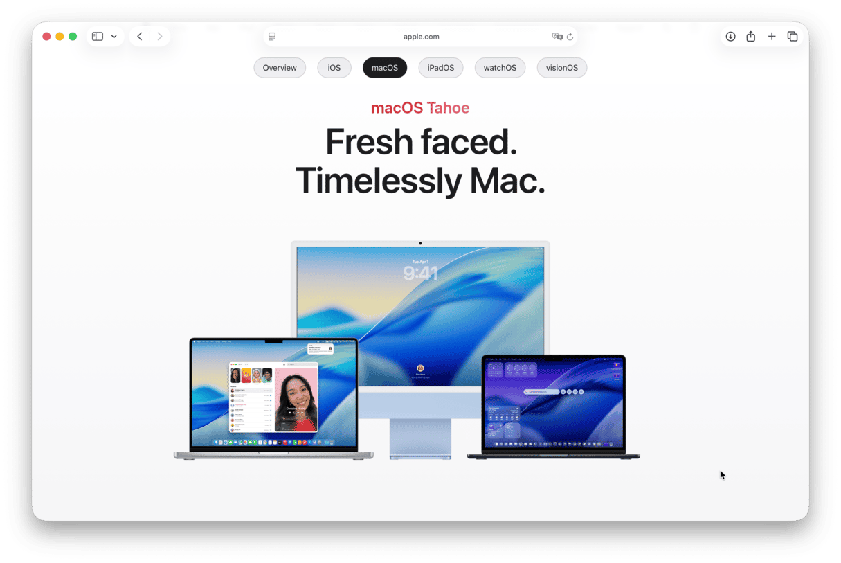
But here's the catch: Tahoe runs background optimizations differently. It caches more aggressively, which means after a day of working with Photoshop and Final Cut Pro open, Tahoe actually managed memory better than Sequoia.
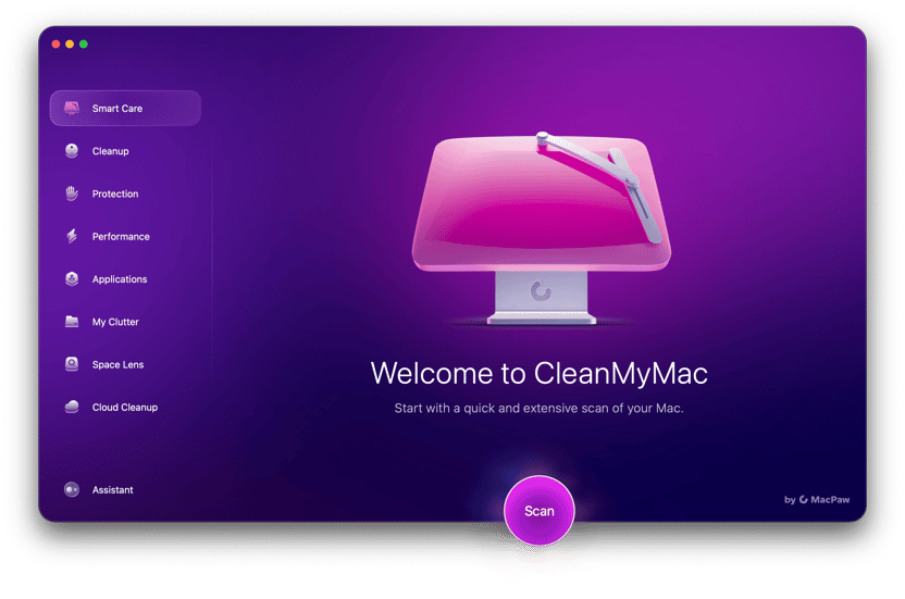
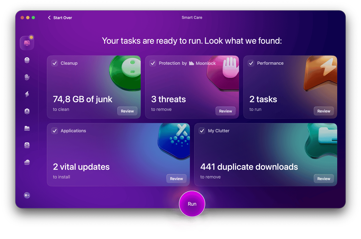
To help, I've also been using CleanMyMac's Smart Care feature once a week to keep both systems lean, and honestly, I feel like it really boosted the overall performance when using macOS Tahoe; here's how to get started:
- Get your free CleanMyMac trial — you can use all the tools for free.
- Open the app and click Smart Care > Scan.
- Select items and click Run.
If you want my completely honest opinion, for consistent daily use, Sequoia wins. But for heavier workflows that push RAM and GPU, Tahoe edges ahead after some system cleanup.
Other key differences between macOS Tahoe and macOS Sequoia
I've realized it's not all new features and apps, some users want to know the basic differences, so here's what stood out to me after initial installation.
Installation size and system requirements
macOS Tahoe is bigger. My clean install was around 14.2GB, almost a full gig more than Sequoia. It also feels heavier on first boot, background indexing kicked my fan on immediately, which didn't happen with Sequoia.
Default apps
There aren't any massive changes here, a few have small refinements, Home feels slightly quicker to load scenes, and Messages has smoother sticker syncing with iOS 18, but nothing that would change how you use them day to day.
System updates and security
This one surprised me. Tahoe installs security updates in the background far more aggressively. In one week, it pushed two silent updates without asking me to restart. Sequoia still relies on the traditional update prompts, which I actually prefer because I like knowing when something is changing under the hood.
Design differences
Switching from Sequoia to Tahoe felt like stepping into a slightly different macOS generation, even though they look similar at first glance, they're not. For instance, in Control Center redesign, Tahoe borrows from iPadOS 18 with chunkier toggles and a translucent frosted background. It's bold, but sometimes in a weird way, it feels kind of oversized on a MacBook screen. I guess, like all new things, it's something you'll need to get used to.
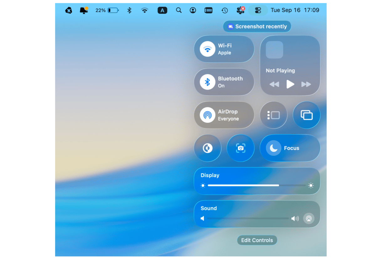
What caught me off guard after a few hours was the new window depth and animation style. Tahoe uses slightly softer shadows and a slower fade when opening apps, which gives it a more fluid, almost iPad-like vibe. Sequoia's animations feel sharper and snappier, more "classic Mac" if that makes sense.
There are also subtle tweaks to system fonts and spacing, as well as the Dock. If you're the type who values a distraction-free workspace, Sequoia's restrained, minimal approach still wins. Tahoe feels a little more playful, which some might love, but personally, I find it slightly busier when I'm in work mode.
Widgets and Desktop customization
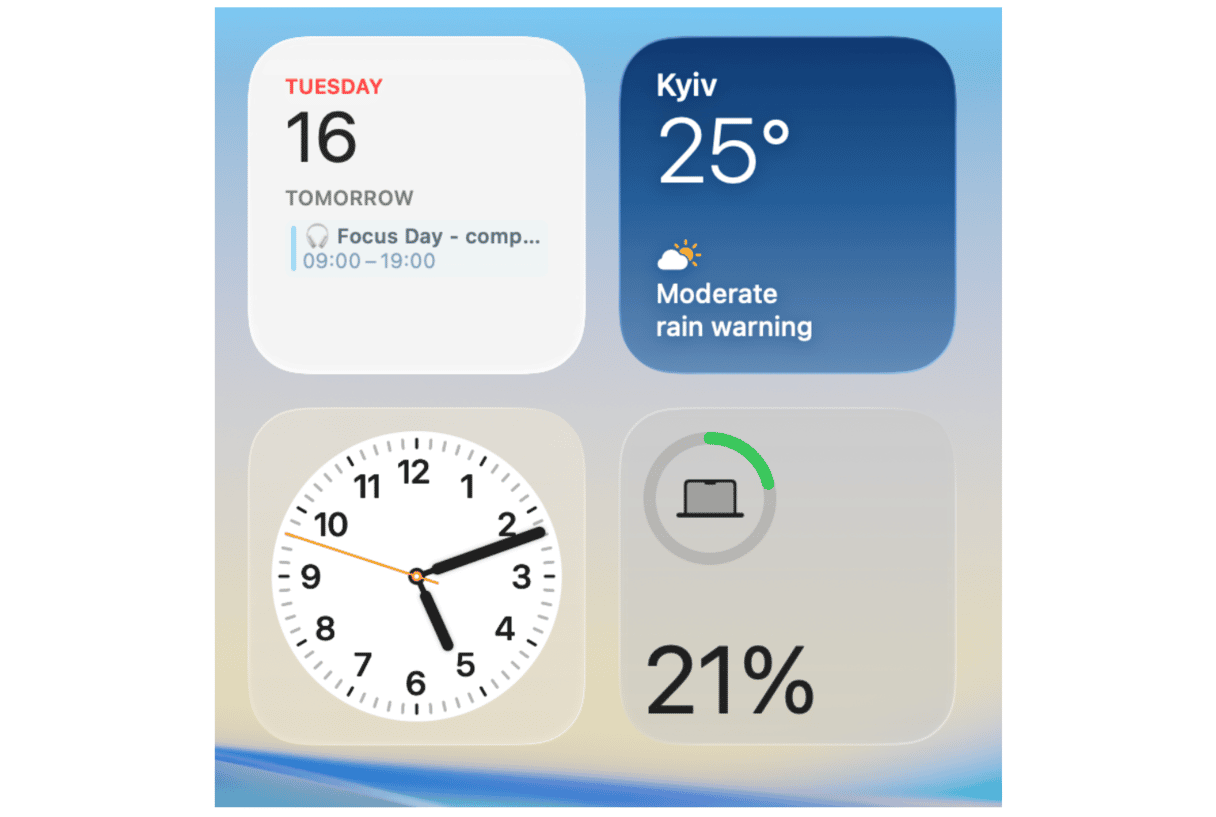
Now, this is where things get interesting. macOS Tahoe's Widgets aren't just more visually appealing, they're functional in a way Sequoia never managed. Sequoia's widgets look almost frozen by comparison; they're still static info panels. They update, sure, but they're not interactive.
The trade-off is resource usage. Tahoe's widget engine eats into system memory, and on older Macs, this might prove annoying.
Siri and AI improvements
Sequoia introduced a smarter Siri, but it's still Siri. macOS Tahoe, however, integrates deeper with Apple's new on-device AI models; it's still not perfect or as powerful as some of the bigger AI names, but it's in the early days.
Software compatibility and app performance
Some of my older apps behave better on Sequoia, but like with all new major OS updates, that's not entirely unusual. But new apps optimized for Tahoe absolutely fly. Rendering 4K footage was 10% faster for me compared to Sequoia, likely due to improved Metal API optimization.
Battery life comparison
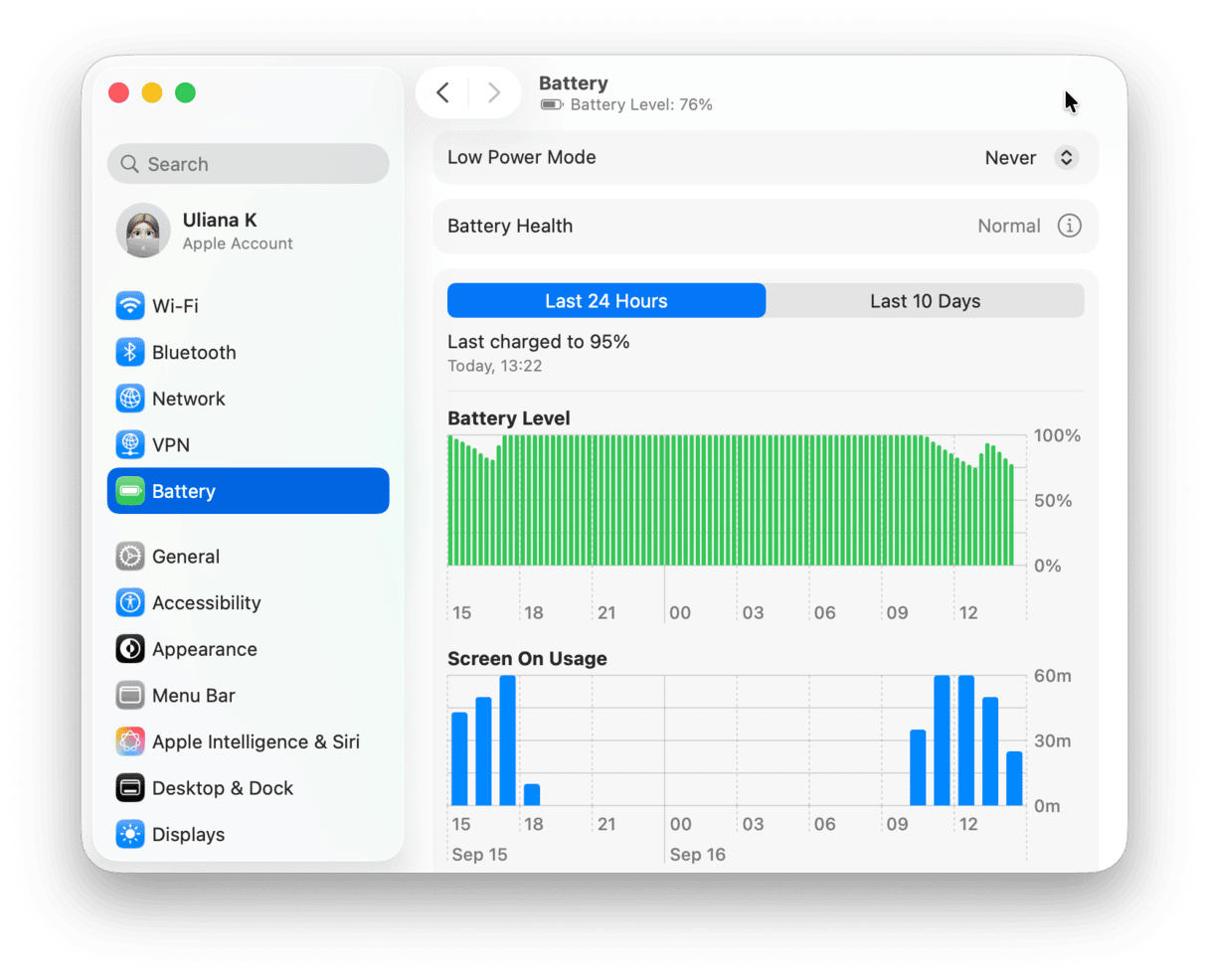
I tracked this obsessively for a week on my 14-inch MacBook Pro:
- Sequoia: 9 hours 20 minutes average battery life (mixed browsing, writing, and Photoshop)
- Tahoe: 8 hours 35 minutes with the same workflow
There is not a huge gap, but it is noticeable if you travel a lot. Tahoe's widgets and background AI indexing drain more battery.
Well, my verdict is pretty simple. macOS Sequoia vs Tahoe isn't about which is better; it's down to what you need. If you're the kind of user who loves experimenting, customizing your desktop, and testing Apple's latest AI experiments, then yes, Tahoe is the clear winner. But if you need stability, better battery, and wider app compatibility, Sequoia remains the safer choice for now: it's refined, efficient, and reliable. If you do decide to make the jump to macOS Tahoe, don't forget to run the Smart Care feature from CleanMyMac weekly. It genuinely helped me reduce the slowdowns that early adopters usually complain about.


