Functionality vs. purity, complexity vs. simplicity, obviousness vs. ingenuity — once you get into app design, it’s always a big challenge to find the right balance.
So, what’s behind Hider’s app design?
The original Hider version is about 6 years old and has already become outdated. Recently, the MacPaw team decided to update it by collecting feedback from customers and subduing our own wishes. After the first brainstorming session, we realized that we needed to make a completely new product, not like the old one. Before Hider, a user could hide a file with their password, but this was not enough for us. So, we decided to add encryption to hidden files in a hidden vault.
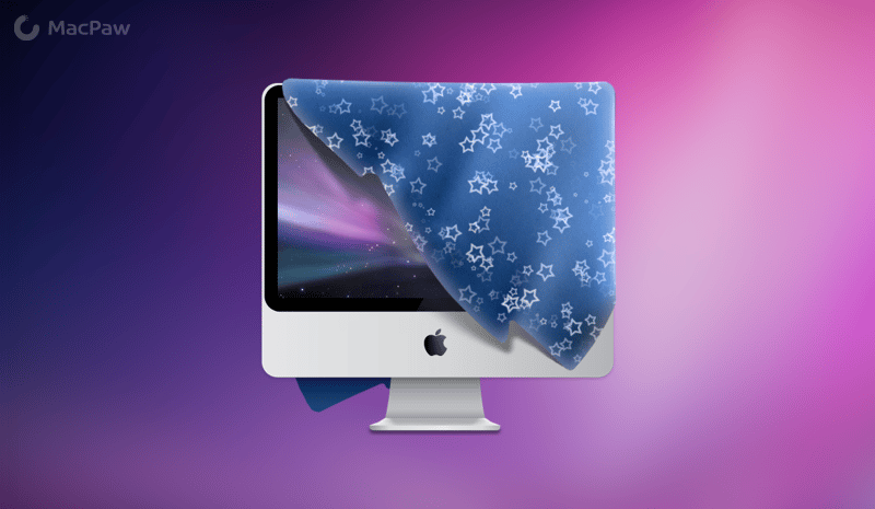
The original Hider app icon
Typically, at the beginning of any working process, I have nothing for inspiration. I get a list of the app features and restrictions related to AppStore and the operating system. I like to start the task this way, since there are no limits placed upon the imagination, and there is no clear visual image in my head. However, in the meantime, such tasks are the most challenging: you can not spy for ready-made solutions, there is no place to look for ideas — so you roll up your sleeves and get to work!
Start
The process of design is unusual. For MacPaw, it is important to convey the feeling of using an app, its atmosphere. First, I create a finished single-screen design, place it on the desktop, and change the wallpaper. It is important for the app to look cool on any Mac with any “dressing.” Specifically for Hider, it’s crucial to convey the sense of reliability and protection. With this in mind, Hider’s design was made in cool, dark colors with highlighted elements of warm yellow. The choice of the basic colors also takes into account the problem of people with poor eyesight or various degrees of color blindness. Despite the impressive list of what should be in the product, at the beginning I try not to pay attention to it. The window is drawn the way I intuitively want to see it — the intended purpose of the app should be clear from its icon.
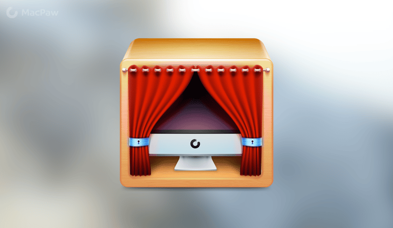
MacHider icon
Sketching
After the team approves the visual concept, layout, and workflow, sketches are created on a piece of paper and are then made in the draft design to fit the actual size. This is a long, arduous process because the team is struggling in the guts of the application to implement functionality and new features. And here I am, trying hard to get the ease of use and the clarity of the interface.
Once we confirm the workflow, I draw the final application screens, in all possible states, to see how things will look live. I’m extremely detail-oriented and like to come up with fun things in the interface, for example: if you look at the start screen where you need to enter a password, you can see that the code lock on the safe rotates when you type your password and unlocks the app as if the safe door is being opened. It’s a minor thing that gives a pleasant visual appeal with daily use of the product. It’s all these little details that add up.
Since all the elements in the interface are custom, it’s me who creates a set called GUI Kit.
To draw the interface and icons, I only use Sketch.app — it’s an easy-to-use tool for designers who work with on-screen graphics. With Sketch, I can promptly make changes. It’s not time-consuming to edit or export virtually. It’s convenient that the entire project, from prototype to final design, and slicing graphics are stored in a single file. The app is very fast and has an austere interface, which makes it a wonderful work environment to stimulate discipline. Plus, it results in clear graphics without excessive trifles.
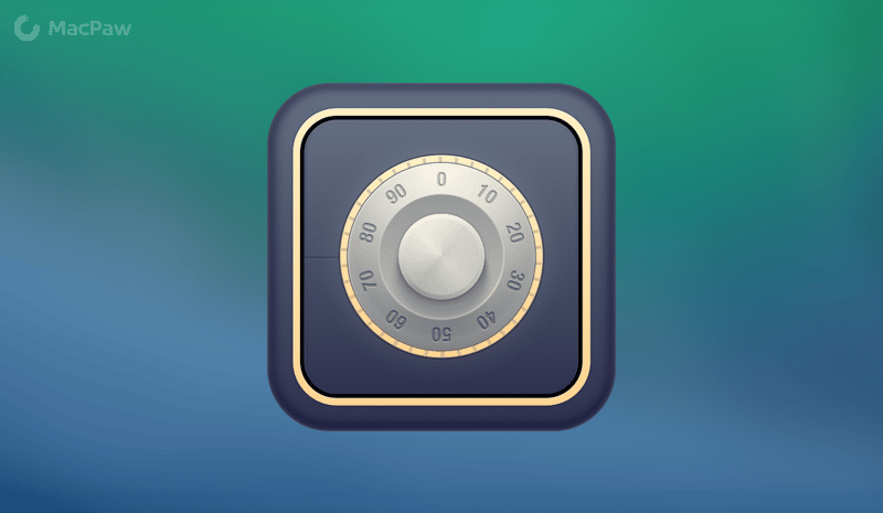
Hider 2 icon, OS X Mavericks design
Application icon
An icon is a representation of the application before the user launches it. The metaphor is very important for understanding what the application does and why it is needed.
For the first version of Hider, an iMac was drawn covered with a magic cloth. When we redesigned the first version, the iMac box behind the scenes was depicted. So, I liked this icon due to the combination of colors and the way it looked in the dock.
With the second version, we have changed the priorities. The design of the application is completely different from the original one. The icon has experienced meaningful changes. First, I made a vault covered with a cloth, but the icon looked too hard and did not correlate with the elegant and simple interface of the app. Thus, the icon was simplified and depicted as a vault. However, with the shift in design from skeuomorphism to flat, it was decided that we simplify the icon in a way to make it look more appealing in the dock and Appstore.
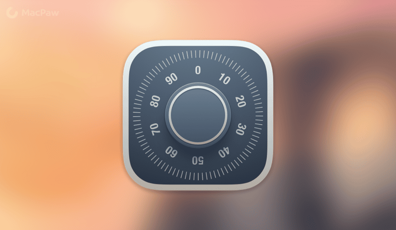
Hider 2 icon, OS X Yosemite design
Future
With almost every product update, we do not only fix bugs, increase the app performance, or add new features — but also refresh its design. And of course, with the release of OS X Yosemite, we rolled out a major Hider update with a slightly altered visual style, which is a perfect match to the new operating system.
- Dmitriy Novikov, MacPaw Product Designer @Novikoff


